Responsive Design
While this project visually presents three reference layouts — smartphone, tablet, and desktop — the underlying system was tested and designed to adapt fluidly across a wider range of screen sizes.
ensuring the layout remains usable and readable even on compact or older devices. Rather than designing for fixed devices, the system relies on flexible spacing, scalable typography, and content-driven breakpoints that allow it to respond naturally between sizes.
Smartphone - Dark Mode
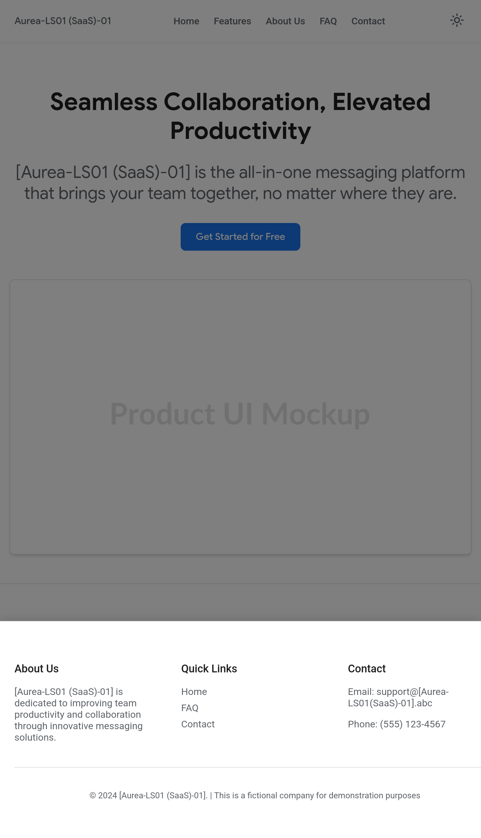
Home page / Landing page

Features page
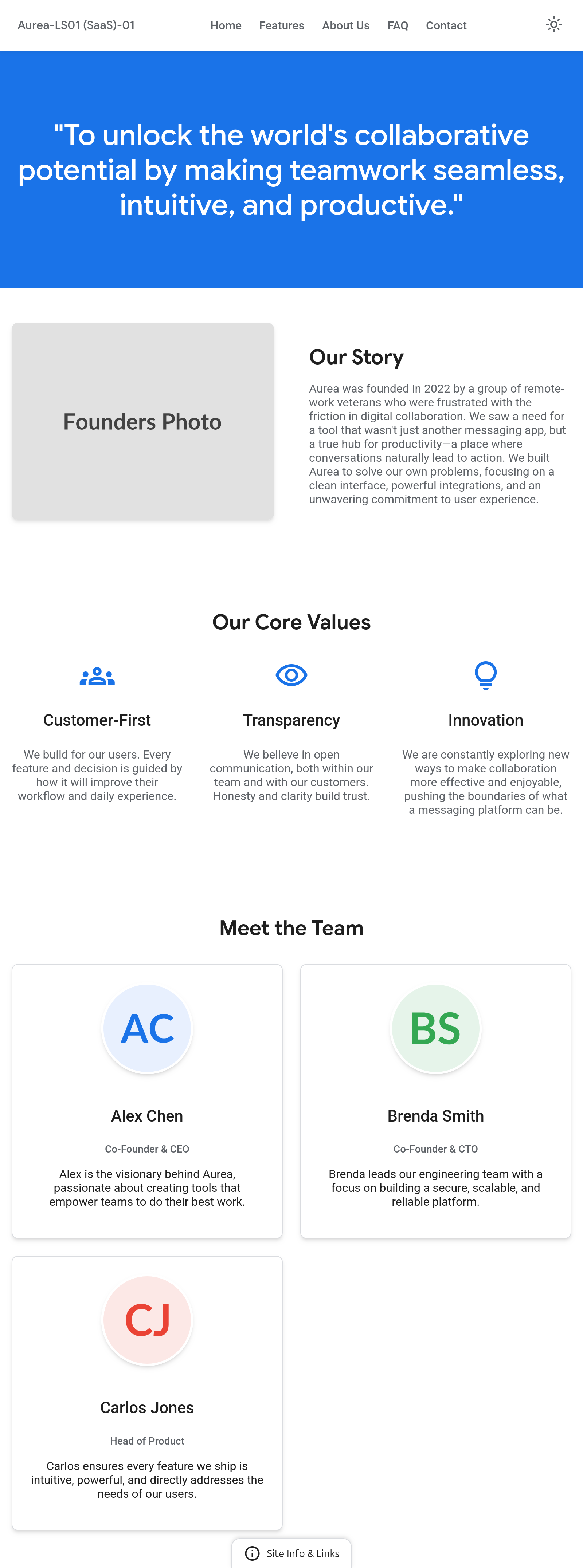
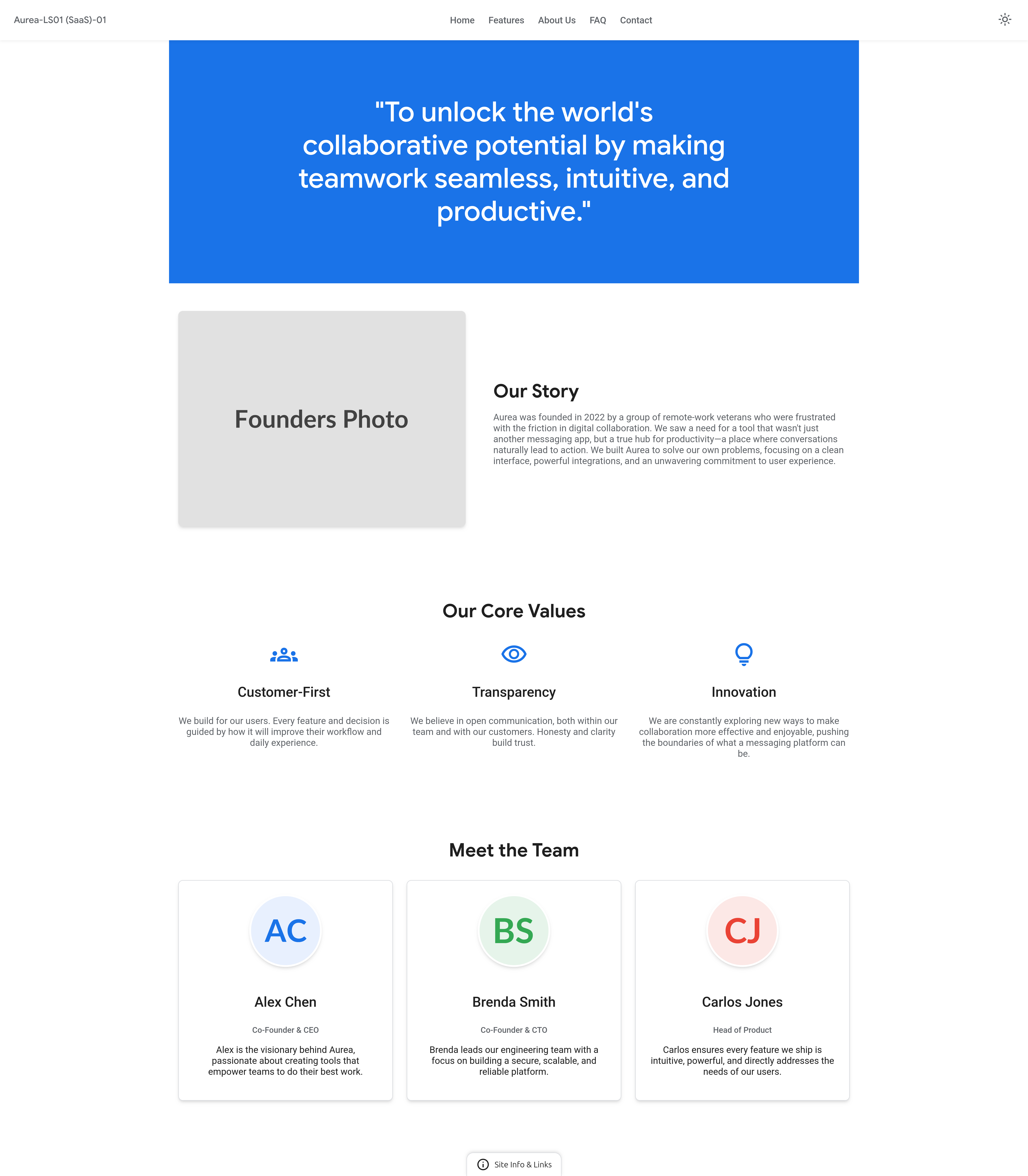
About Us page
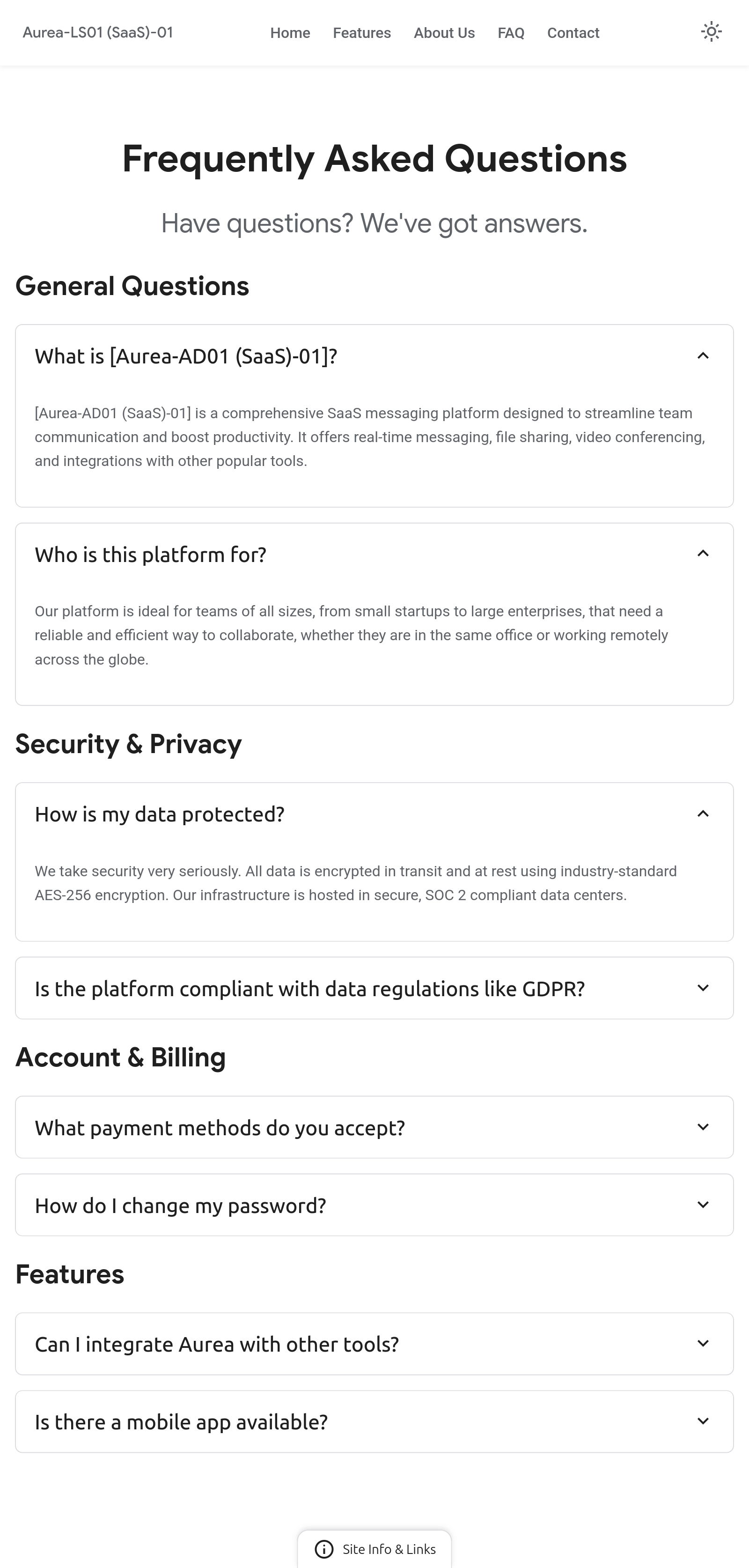
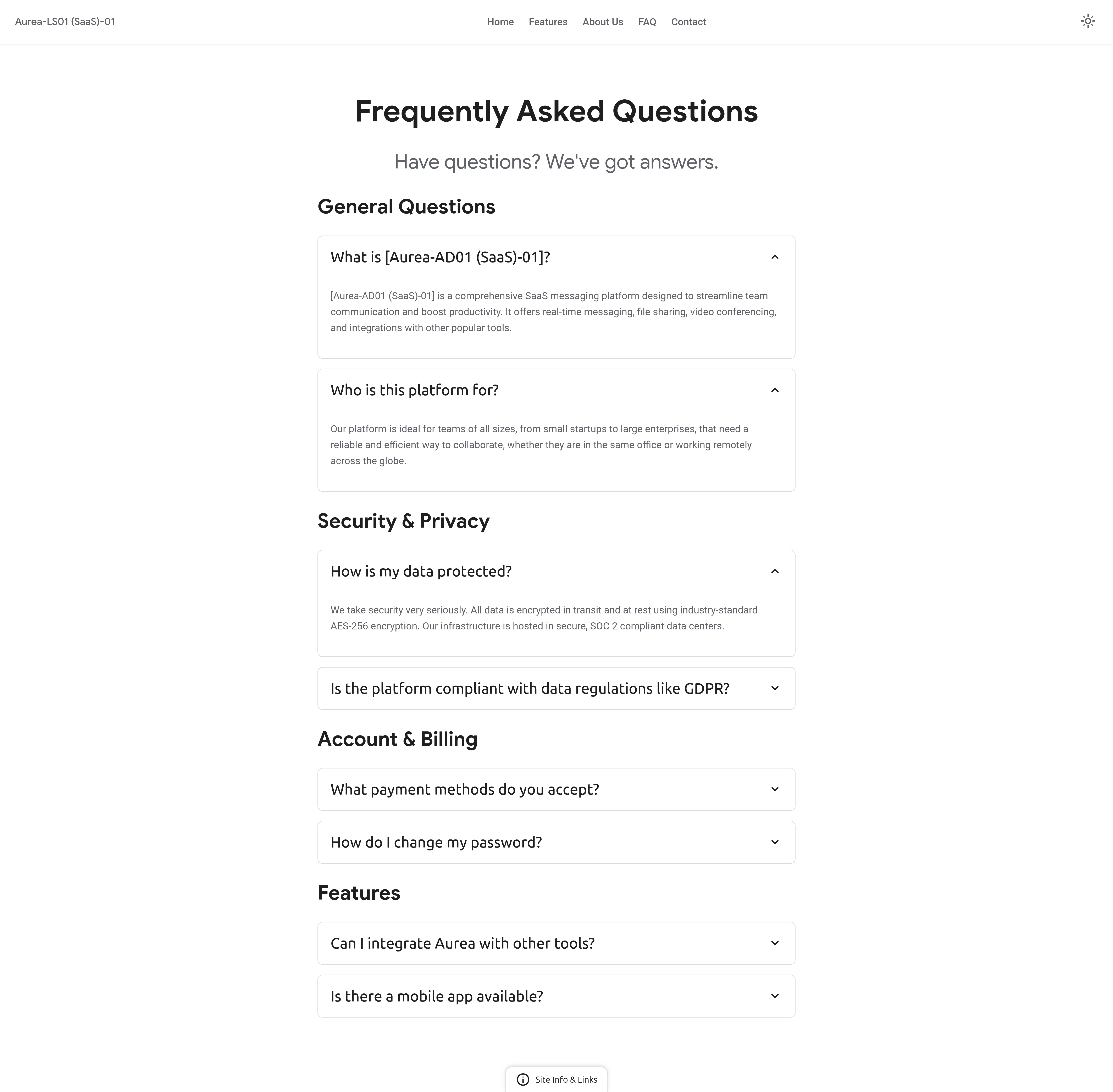
FAQ Us page
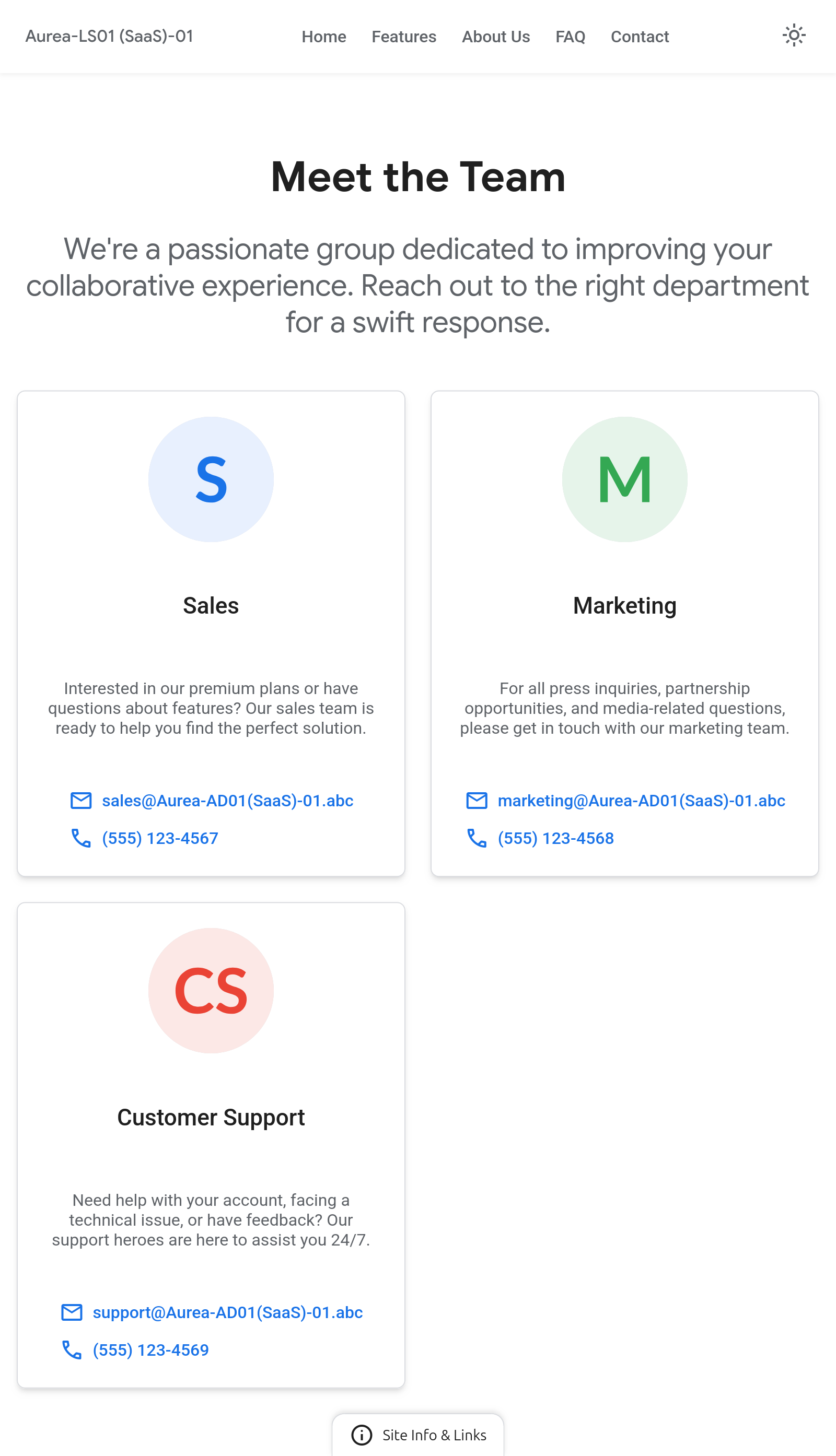
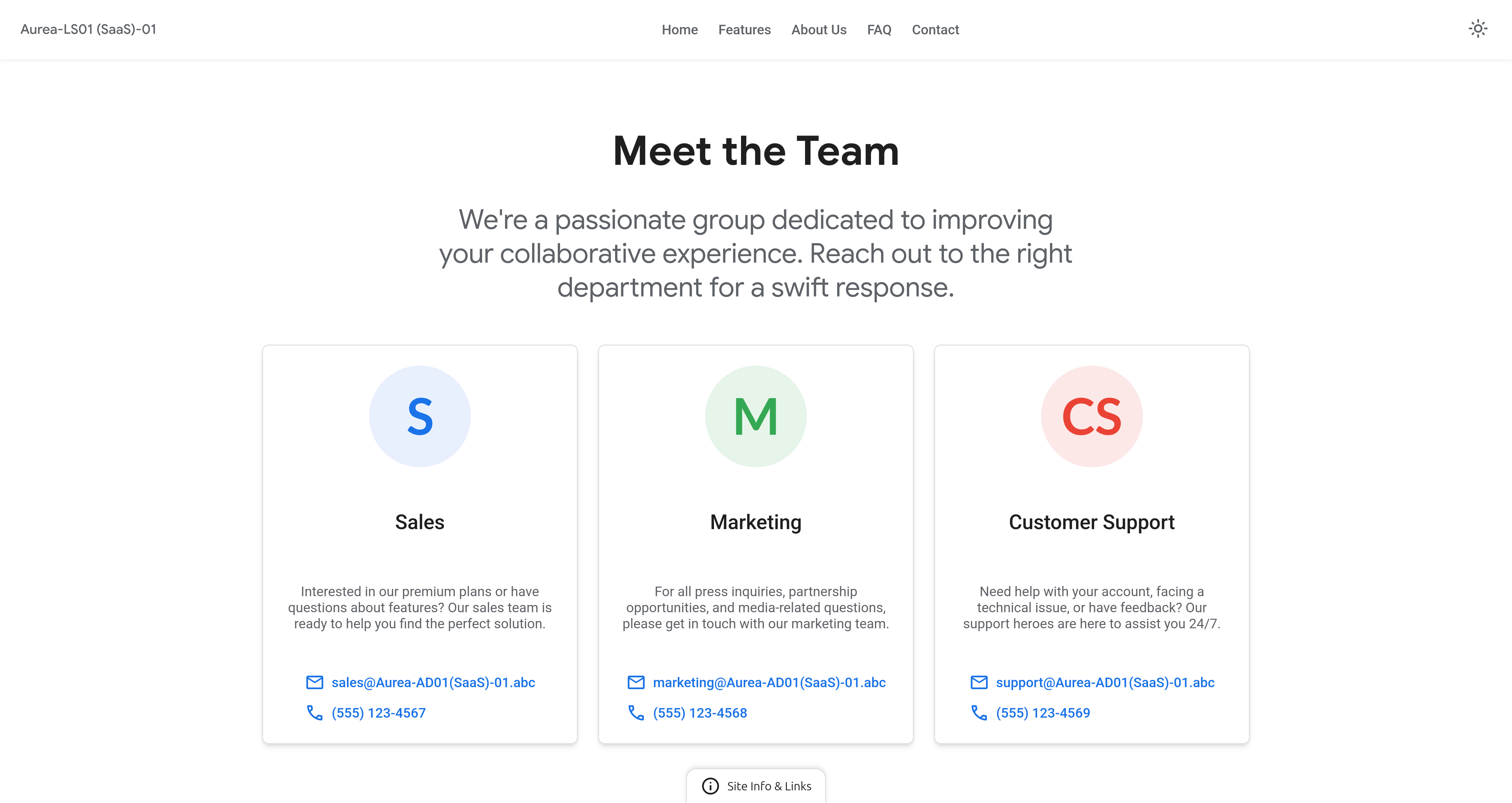
Contact Us page
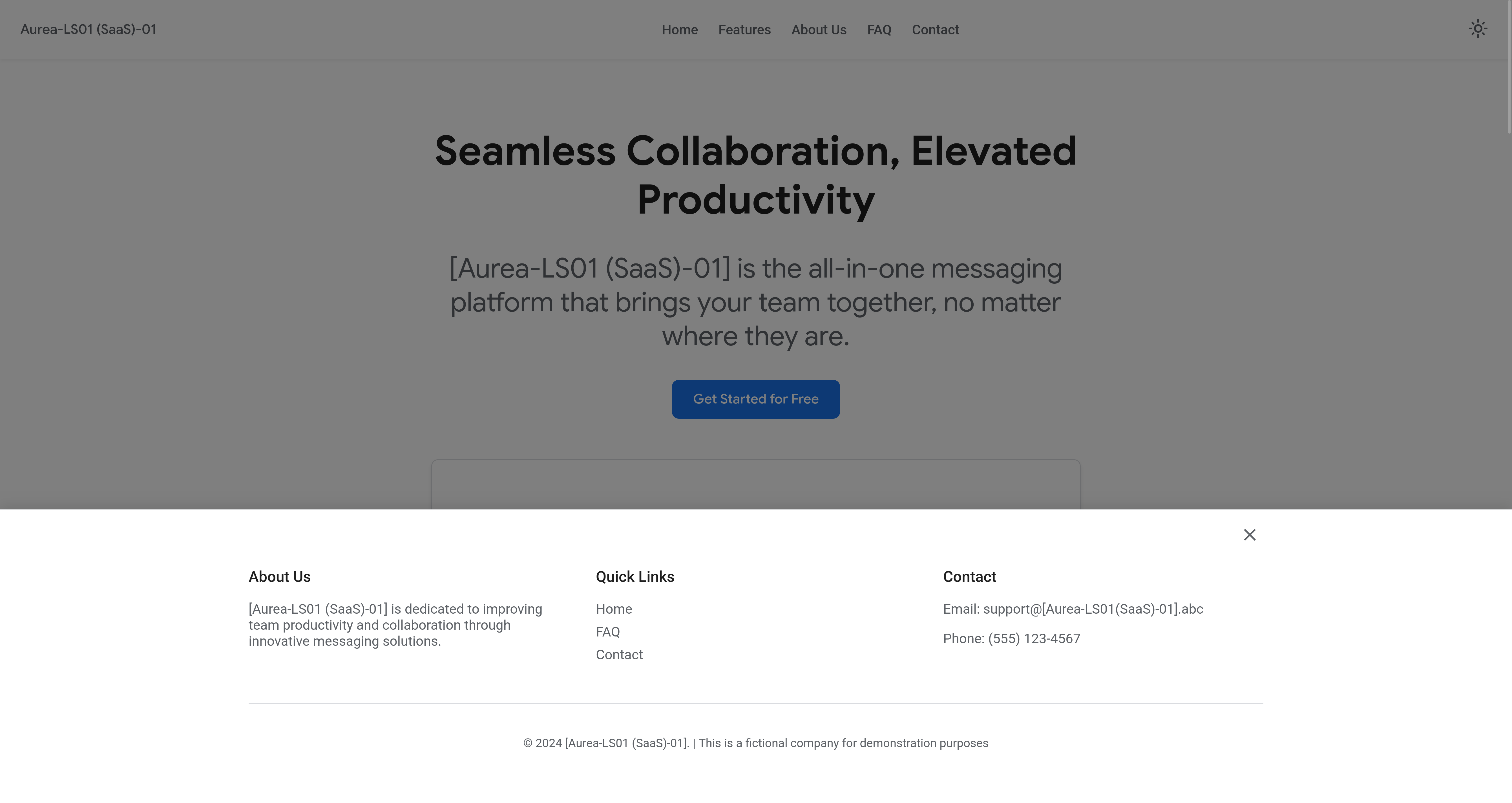
Footer active
Smartphone - Light Mode
Home page / Landing page

Features page
About Us page

FAQ Us page
Contact Us page
Footer active
Tablet - Dark Mode
Home page / Landing page
Features page
About Us page
FAQ Us page
Contact Us page
Footer active
Tablet - Light Mode
Home page / Landing page
Features page
About Us page
FAQ Us page
Contact Us page
Footer active
Desktop - Dark Mode
Home page / Landing page
Features page
About Us page
FAQ Us page
Contact Us page
Footer active
Desktop - Light Mode
Home page / Landing page
Features page
About Us page
FAQ Us page
Contact Us page
Footer active
Why screenshots instead of a live demo?
The implementations shown are fully functional and tested. Screenshots are used intentionally to present verified behavior while protecting the underlying code and system logic from unauthorized access, scraping, or redistribution.
This approach allows transparency in outcomes without exposing the full implementation outside of licensed use.
Responsive Design Validation
Spacing and rhythm were verified visually, not assumed.
Temporary layout outlines were used as a diagnostic layer to inspect component spacing,
alignment, and structural balance. This helped ensure the system scales consistently and
maintains visual clarity across screen sizes.
The screenshots shown include temporary layout boundaries used during validation. These markers are not part of the final implementation and were applied solely to inspect spacing, hierarchy, and component relationships during the design system’s development.
Temporary layout outlines: Smartphone screen size


Temporary layout outlines: Tablet screen size
Temporary layout outlines: Desktop screen size